What Unsustainable and Unaffordable Looks Like
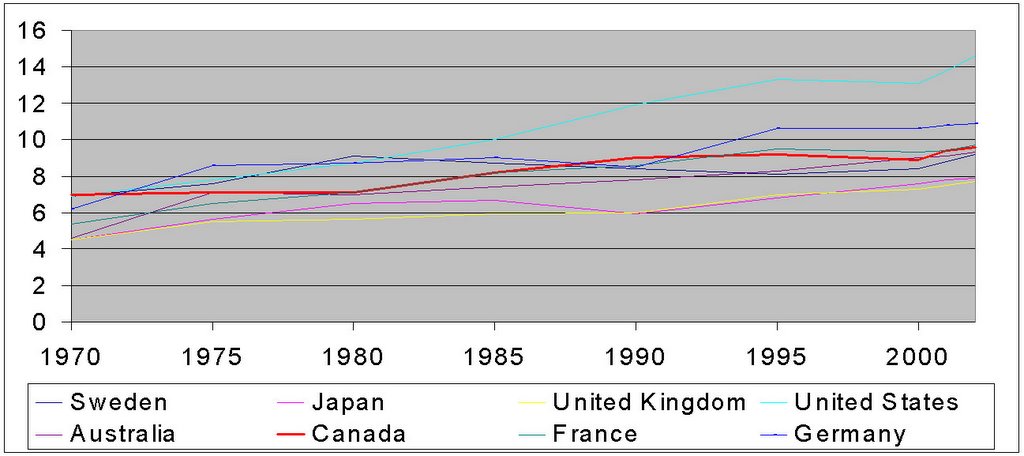
One more chart of health care numbers from the OECD, this one addressing the notion that health spending is growing out of control in Canada. The graph is total spending on health as a percentage of GDP over time. The thick red line is Canada. As usual figures extend to 2002, and you can click on the graph to expand the image:

Some thoughts: 1) The Japanese have one of the world's longest life expectancies, maybe they simply don't need to spend as much on health. 2) Perhaps there is a reason that Brits are known for bad teeth! 3) More seriously, if there is one country on this chart where health spending could be characterized as unsustainable or unaffordable, well, you know.
Some thoughts: 1) The Japanese have one of the world's longest life expectancies, maybe they simply don't need to spend as much on health. 2) Perhaps there is a reason that Brits are known for bad teeth! 3) More seriously, if there is one country on this chart where health spending could be characterized as unsustainable or unaffordable, well, you know.
posted by Declan at
Sunday, March 05, 2006
![]()


8 Comments:
Fascinating.
It's interesting to me that the two most "unsustainable and unaffordable" countries on that graph are the U.S. and Germany. Those two countries have very, very different health care systems, but what they have in common is that they're both employer-based.
By Idealistic Pragmatist, at 3:50 PM
It looks like the German numbers spiked with reunification, but maybe that's a coincidence, I don't know the history.
By Declan, at 3:56 PM
Ah, that would make sense. (And I do know the history, both professionally and personally.)
By Idealistic Pragmatist, at 4:21 PM
The problem i have with that chart is that unlike the other countries, healthcare isn't a national responsibility in Canada - it's provincial. The deputy premier of Finance of BC has said that by 2017, healthcare costs will suck up 70% of that province's budget if costs keep rising by the 7% of so it's been rising at the past few years. Ontario released similar numbers, so you have to figure that the same applies to all the provinces, and might be even worse for the poorer ones. That is unsustainable and unaffordable.
By Anonymous, at 6:10 AM
Kevin - they are from the OECD (as linked in the post), and represent total health spending, including private health spending, for all countries.
Jo - One of the things I'm trying to get across is that it doesn't matter where the spending comes from, whether it is the federal government (where health would make up a slightly smaller % of total spending), the provincial government, the municipal government (where it would presumably be 90+% of total spending) or from the private sector, paid for by corporations, by private insurers, out of pocket or whatever.
In any case, health care spending is 'sustainable' to the extent that people are willing to spend on health care as opposed to other priorities. Period.
By Declan, at 11:02 AM
I hate it when I take too long to write a comment and then another one gets in in-between mine and the one I was repsonding to!
Anyway, no worries Kevin, I think it was worthwhile clarifying what was meant by total health costs.
By Declan, at 11:05 AM
You should forward this info to that anti-Canadian twit, Clifford Krause, of the New York Times.
By Anonymous, at 2:26 PM
the rise of health care spending as a percentage of provincial government spending in Ontario is the result of provincial government cuts to most other areas of provincial government spending.
i wouldn't be surprised if this holds true for B.C.
And, as said above, it doesn't matter anyway, since the the chart above is reflecting the spending of the societies as a whole and Canada's spending patterns are quite sustainable.
By Anonymous, at 1:48 PM
Post a Comment
<< Home